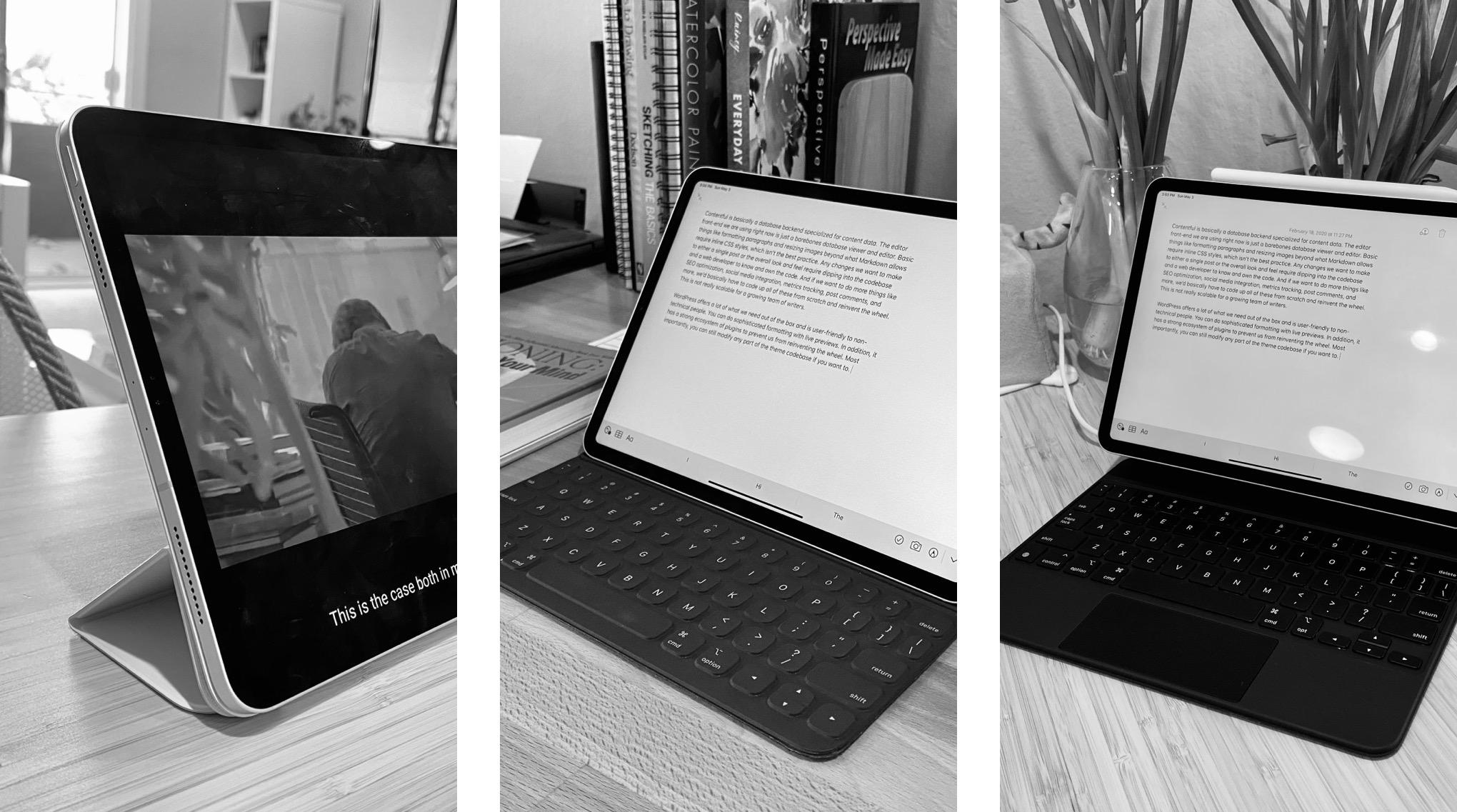
After posting The Case for Tablet Cases last week, I’d like to elaborate more on how the design of a given case encourages certain types of behaviors. Let’s start with the three cases offered by Apple for the iPad Pro as examples.

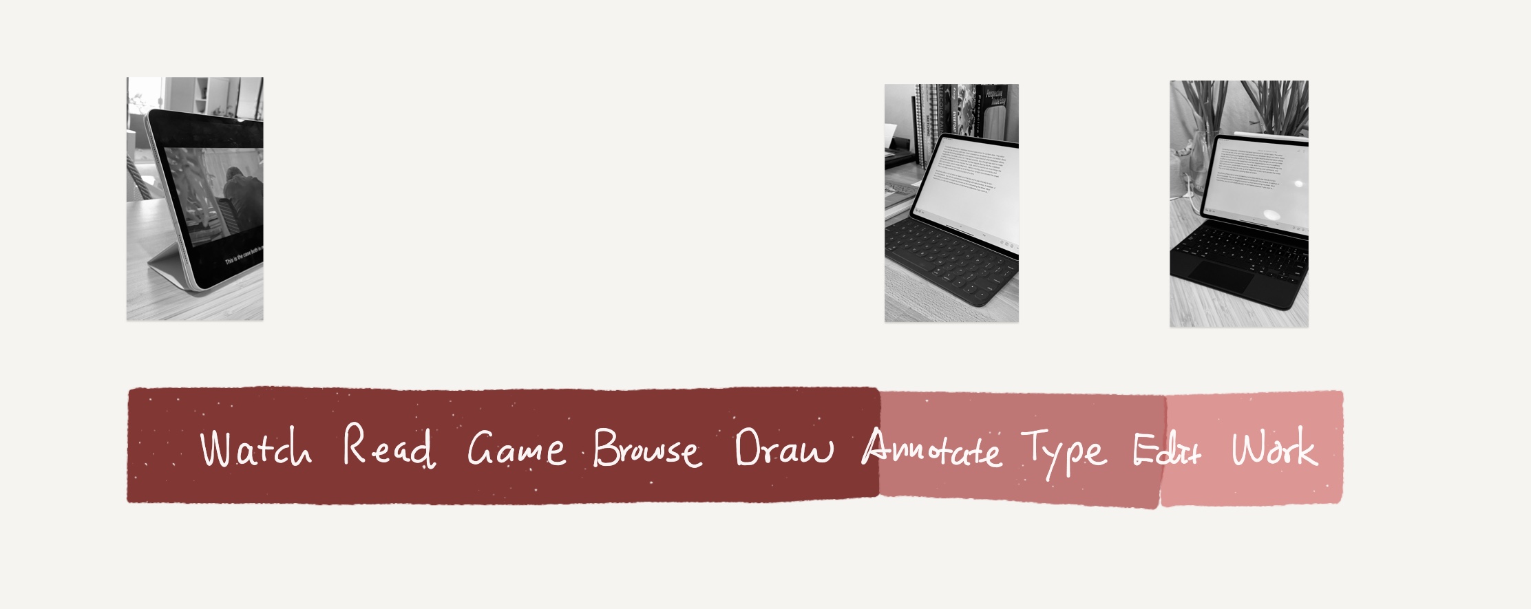
These three cases are a good approximation of how most tablet users generally use their devices. The Smart Folio provides two angles at which you can prop up the iPad for media consumption or annotation—classic tablet use cases; the Smart Keyboard Folio is a relatively lightweight addition that complements the typing experience but can still fold back to be true to the tablet form factor; the heavy-duty Magic Keyboard folio case (or more of a dock) cannot flip over 306º and can be as heavy as the tablet itself, but sports an adjustable hinge, a much better keyboard, a trackpad, and lift-and-go undocking.
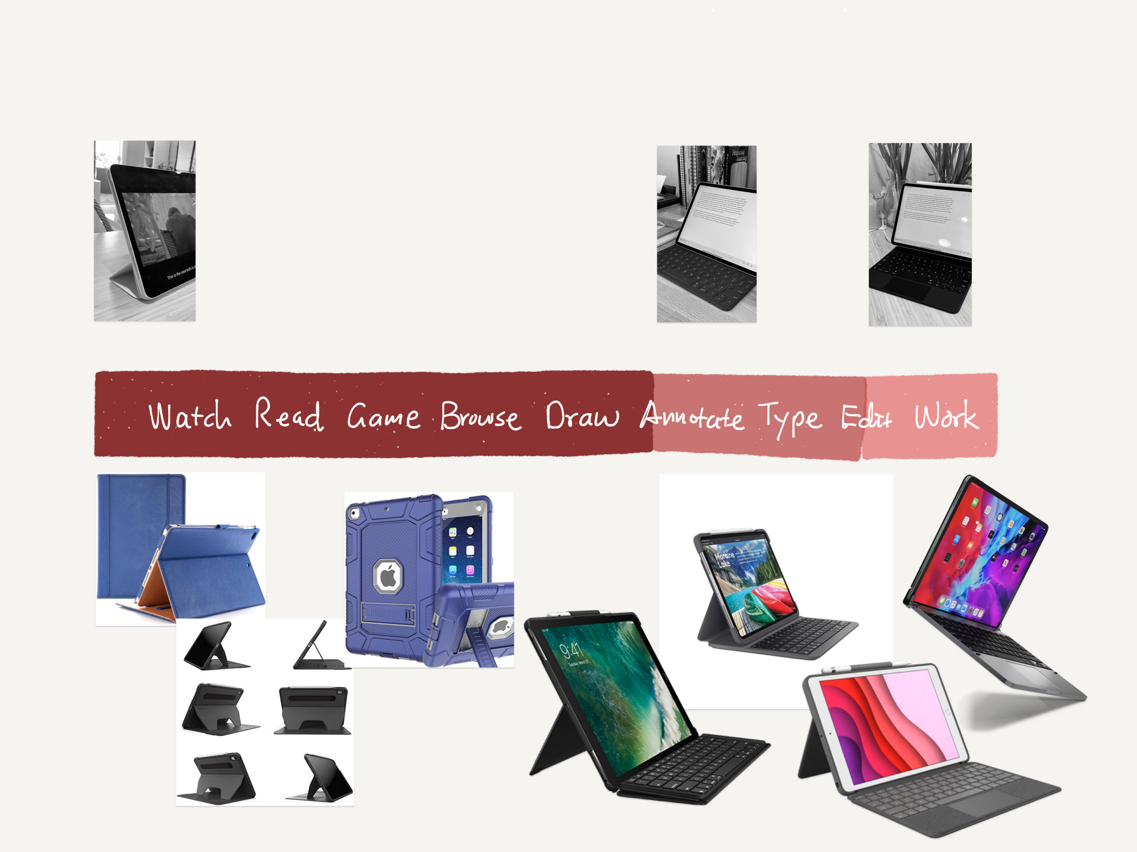
It’s reasonable to say that out of all iPad users, most of them use it for media consumption most of the time, some use it for light typing/productivity tasks, and a small group treats it as a laptop replacement. The farther you are to the right, the more likely you are using it for all the use cases left of it.

Third-party options expand beyond the three approaches above via a plethora of mechanical designs, but each targets a specific band on the spectrum:

Positioning on The Spectrum
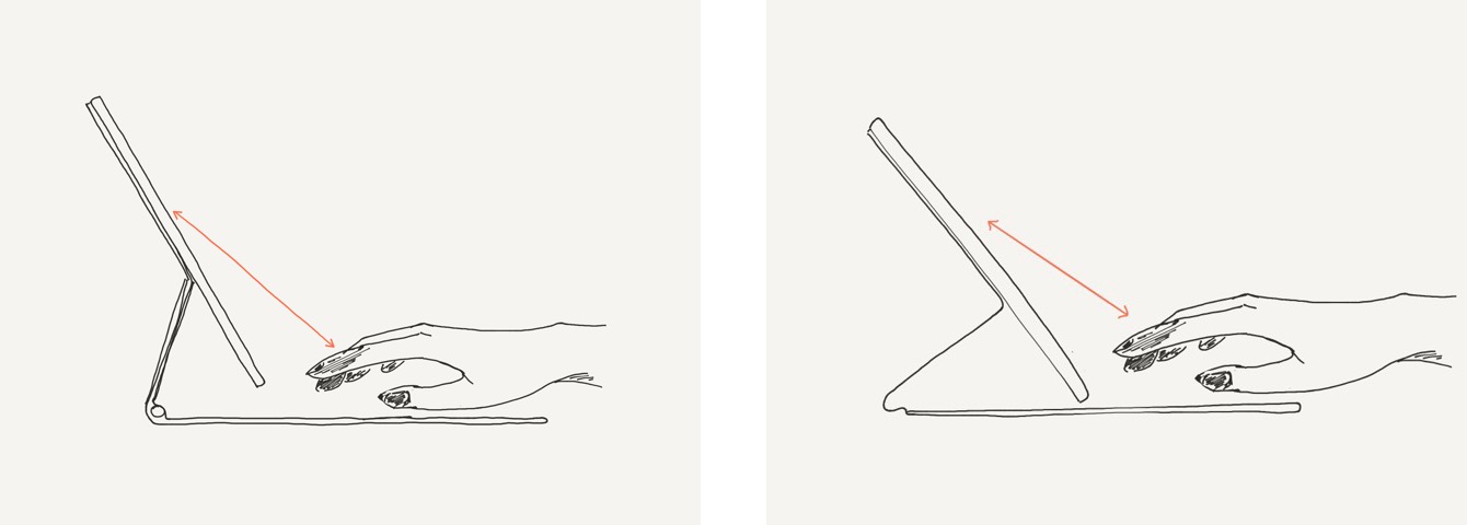
As I mentioned before, cases are mechanically simple but nuanced devices. There’s a lot of factors that a person considers consciously and subconsciously that determine how they like it or how they use it. Weight, flex, texture, grip, balance, aesthetic design. Among these, I think one key metric is important to look at when a user is using the tablet: hand-to-screen distance.
In the case of the Smart Folio or any case that just props up a tablet from various angles, the interaction is 100% touch. But in the presence of another potential input such as a keyboard or a trackpad, the user can travel between the screen and the keyboard. How frequently their hands are on one or another depends on a lot on this hand-to-screen distance.

I think it’s reasonable to say that the farther away the screen is from your fingers, the less encouraging it is to touch the screen. Even a small difference can accumulate over time in the form of arm and shoulder fatigue, nudging you to find alternative input methods. But it also depends on your task at hand. If you’re just plowing through a document and doing a lot of wordsmith, it’s probably more ergonomic for the display to be lifted higher and work on the trackpad and keyboard with your arms resting on the table. If you’re moving around and doing a lot of annotating, reading, and writing, a case that keeps the screen at your fingertips and allows you to flip it around probably works better.
The point is, the spectrum of designs can be roughly sorted on this metric, which in turn determines the most natural input mechanism each case affords. If you do a lot with your tablet, it may be worthwhile to own multiple cases, each serving its unique need. After all, the strength of a tablet is that it can turn into any computer setup at your will at home and on the go.
